Available for collabs
in Jan.27
in Jan.27

PORTFOLIO
2026
2026
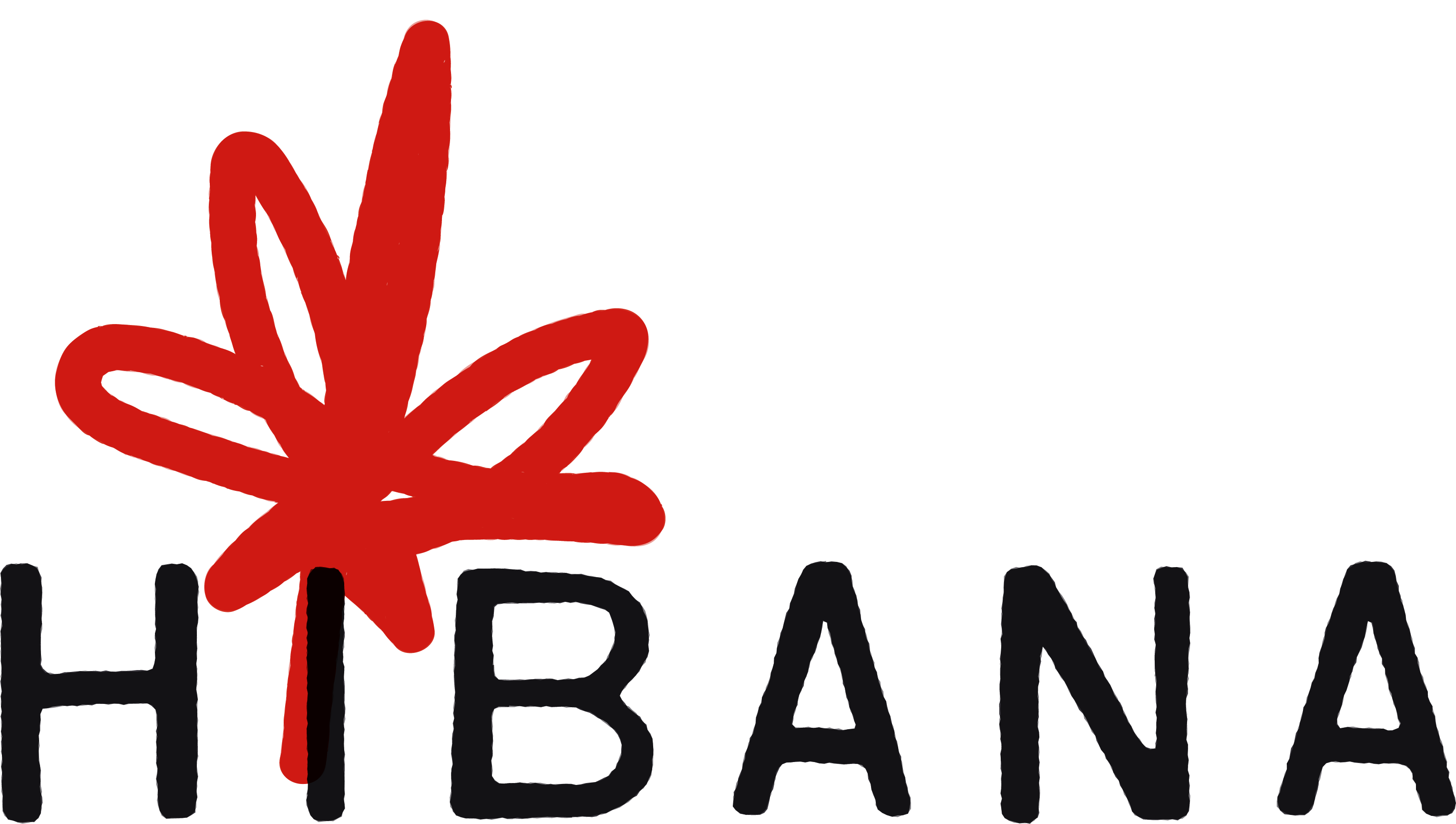
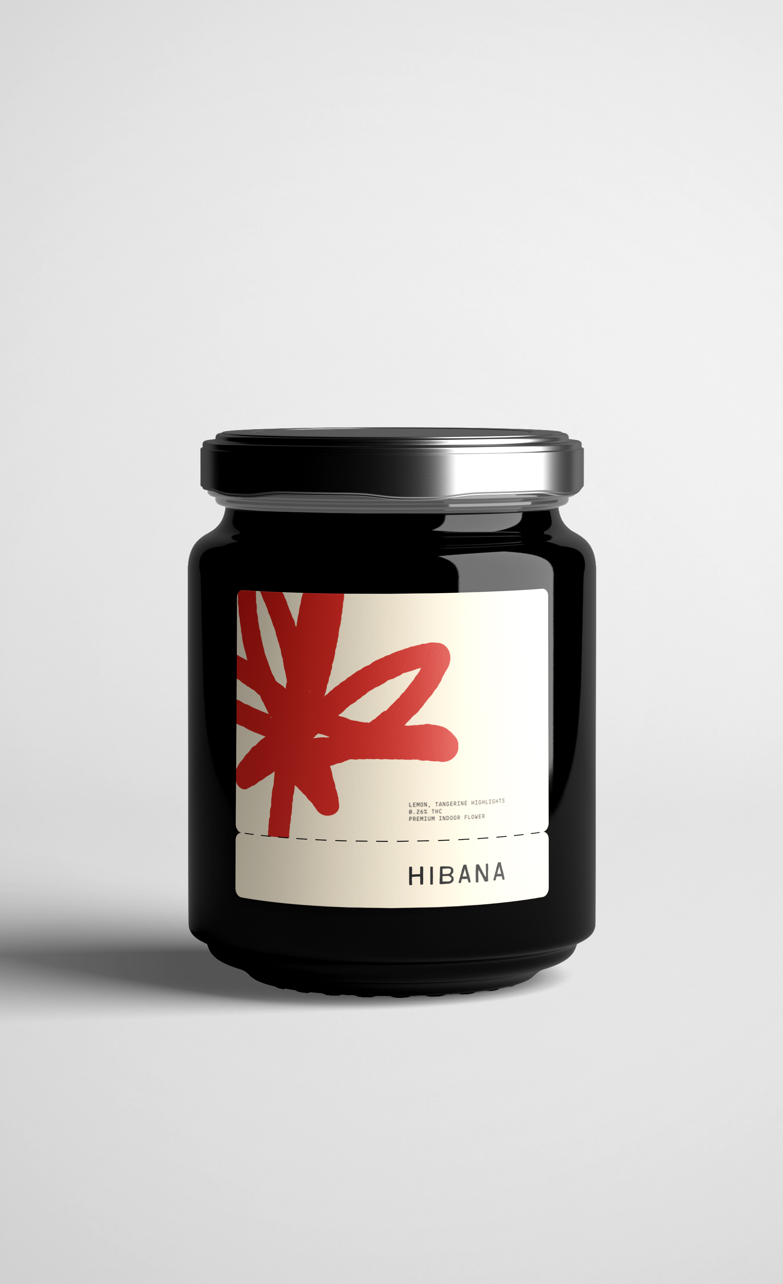
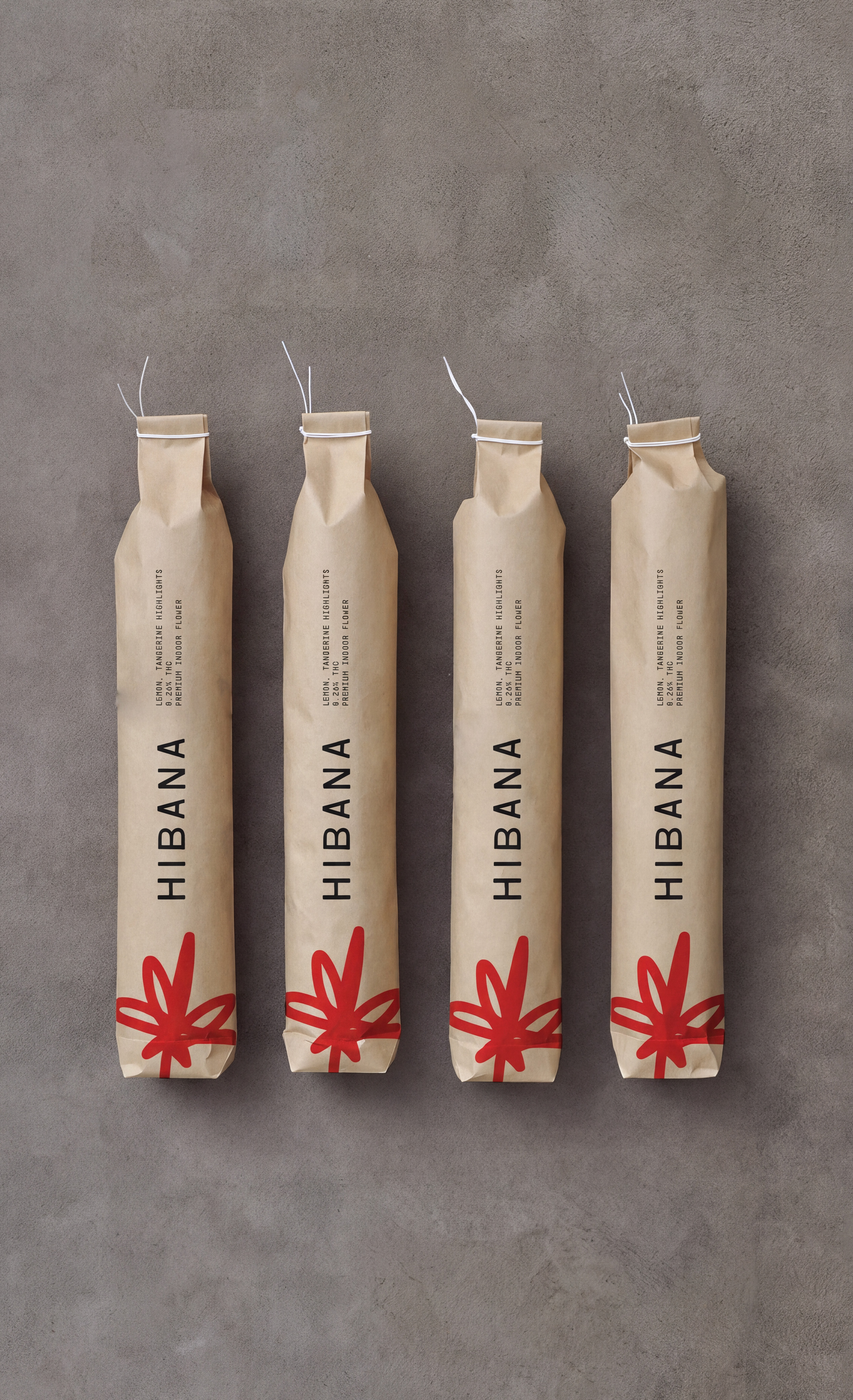
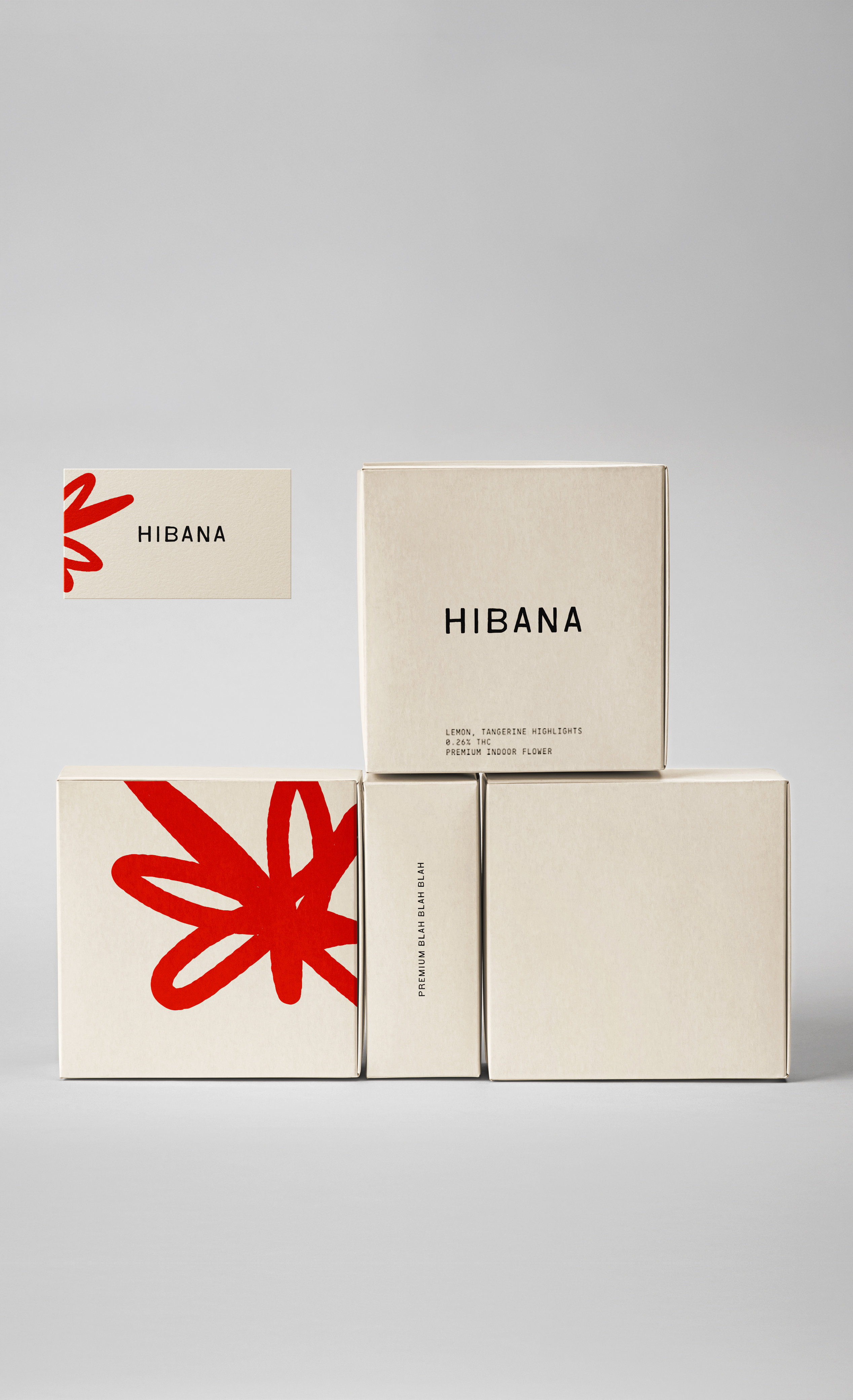
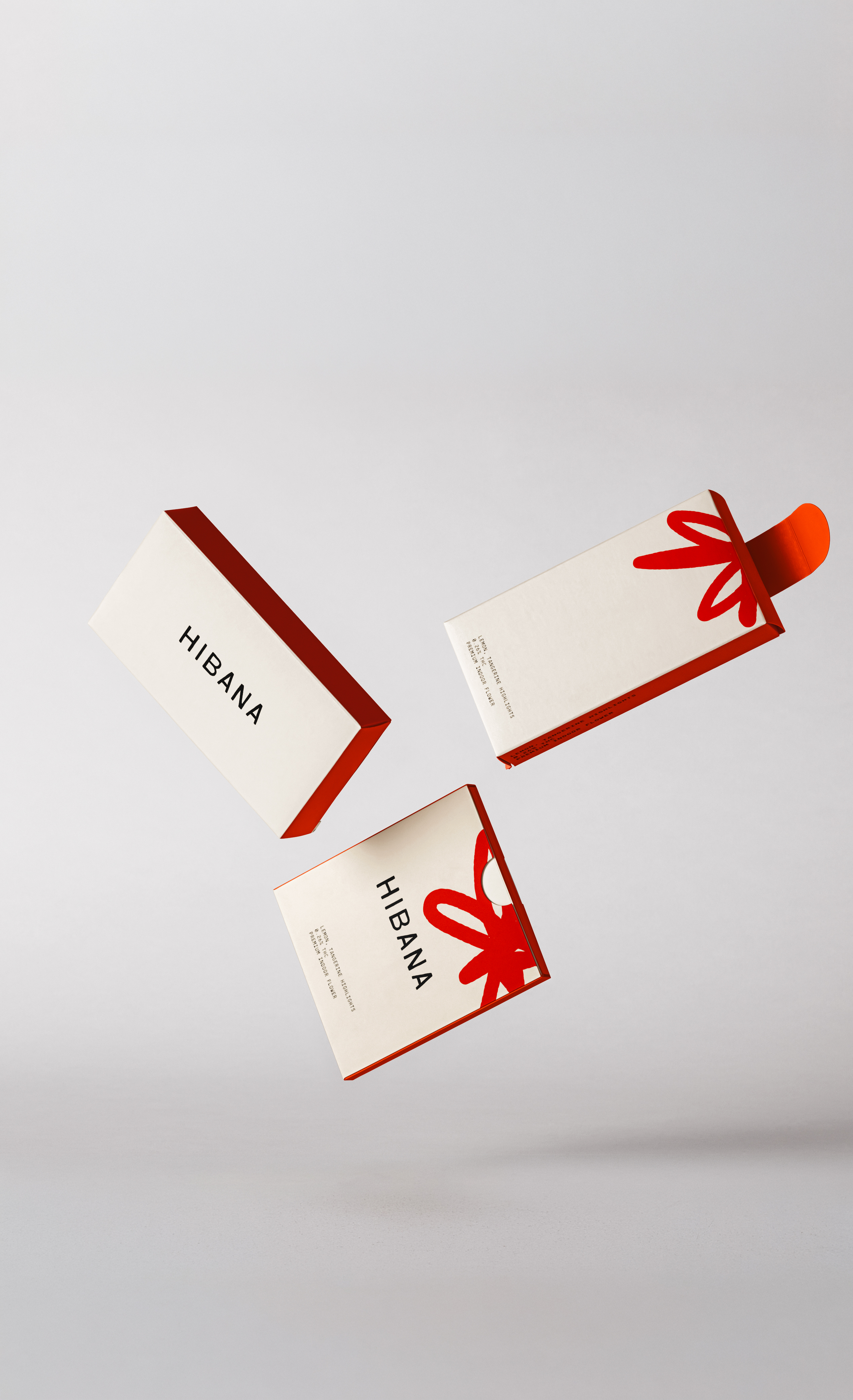
Logo design for Hibana, a new cannabis brand rooted in retro inspired aesthetics. The red mark is a deliberate double meaning, abstractly representing a cannabis plant while doubling as a spark to reference the Japanese translation of Hibana and ground the visual identity in origin and energy.
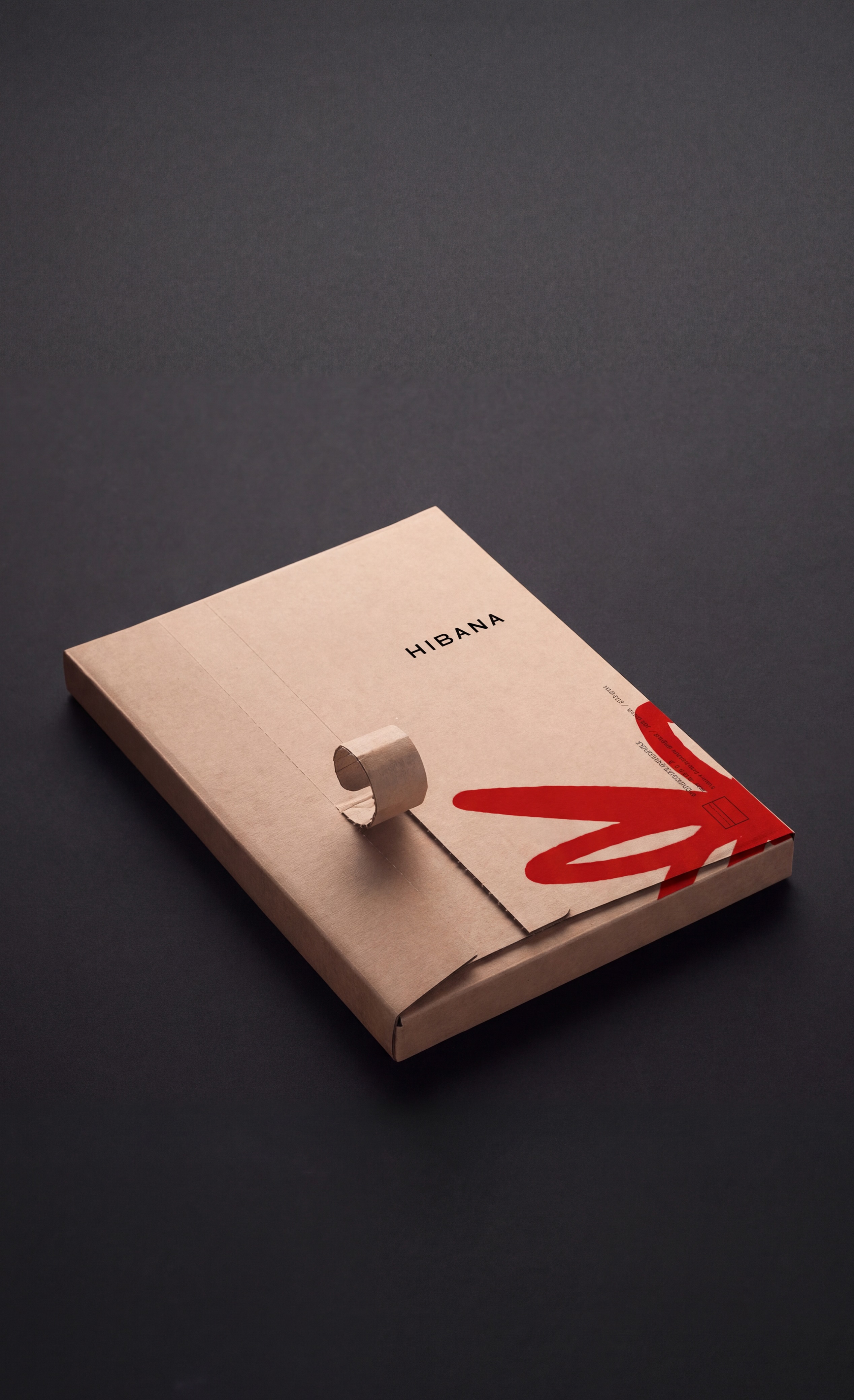
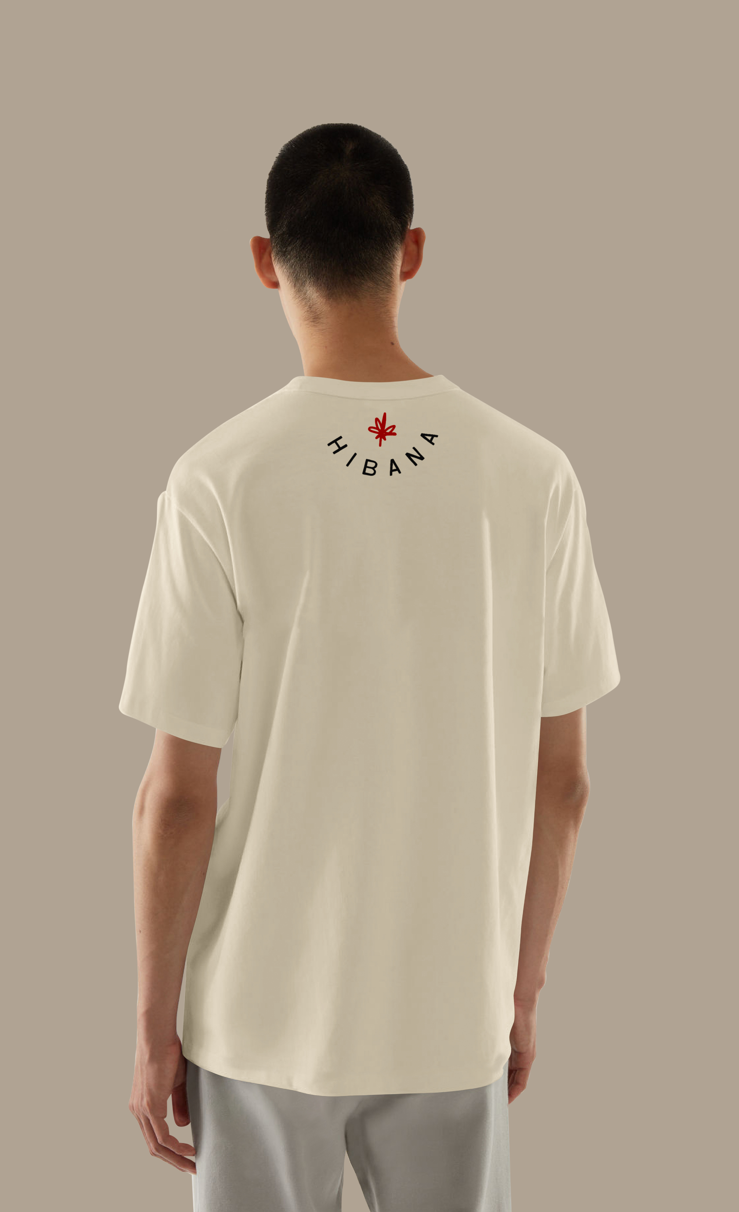
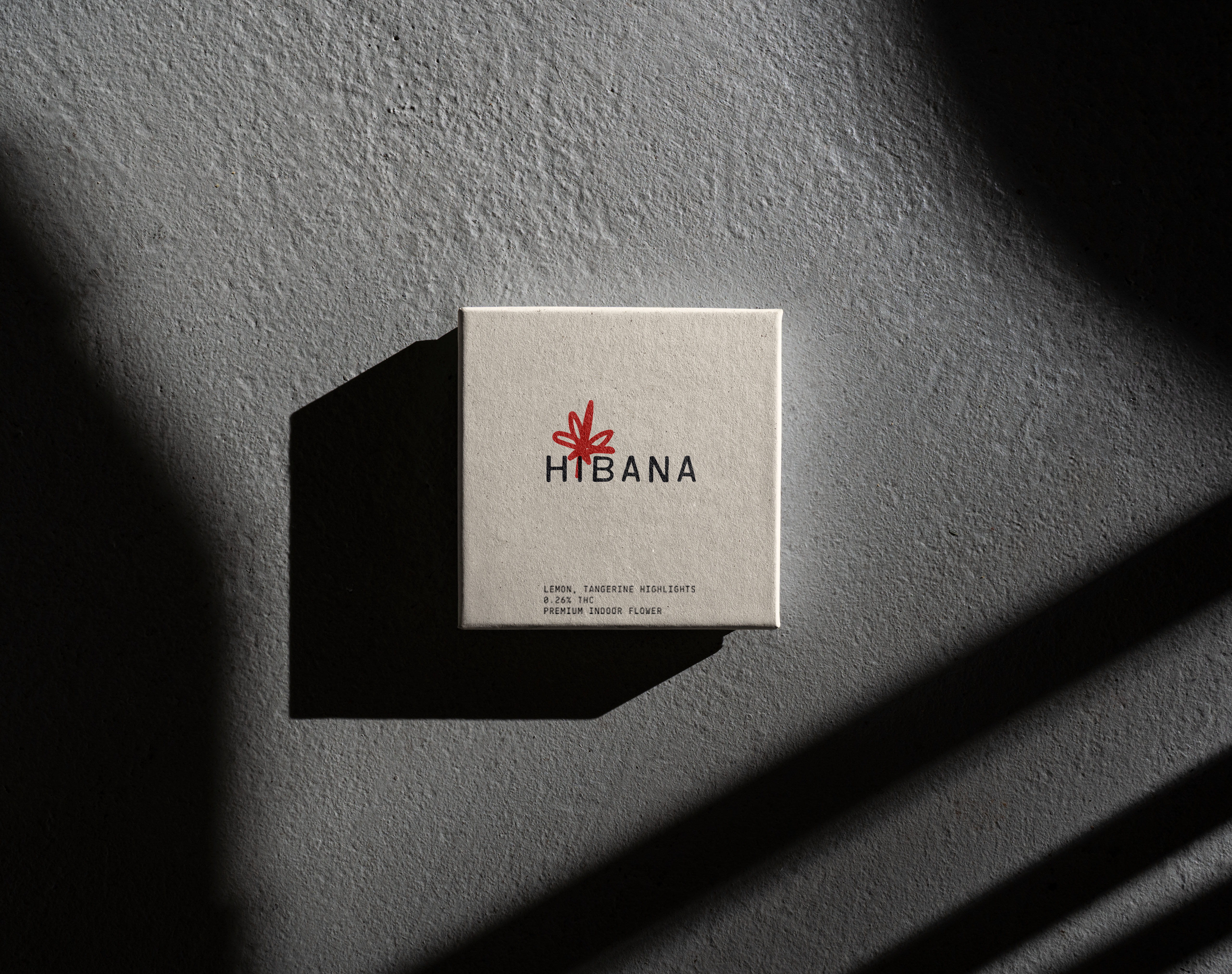
Visual identity and packaging design, including custom logo mark creation, product label systems, preroll packaging, box layouts, and brand collateral.
adobe indesign — layout